A Case for the Mobility of Uber’s Logo-life
Uber has recently announced yet another change to its logo, in what is the latest page in its really long history of identities. At the centre of my initial reaction to the design, I must admit, was a bias for the amazing “branding agency-like” work that the former logo was. But you shouldn’t care. And that’s fine.
[JUST IF: You would rather watch me talk about what I wrote in this article: https://youtu.be/lBjrUoZn-QQ.]
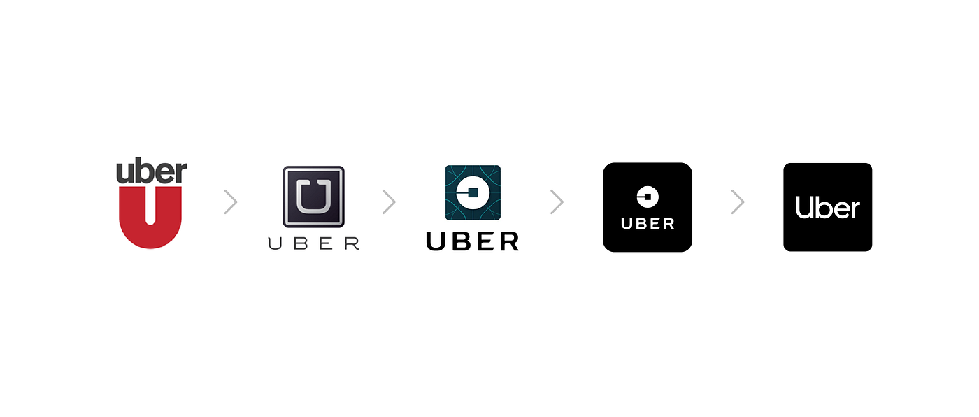
Starting out in 2010 and in the years that followed, Uber tweaked its logo a few times but retained a prominent U letterform and stayed with what became its well-loved logo up until 2016, when Uber unveiled its new logo and a great story (or read “deep”) created around “atoms and bits”. A well-done video with a voiceover that does justice tells of how atoms make the basis of everything “from mothers all over the world to the city of New York…”, while bits is to its innovative technology what atoms is to everything. There was a powerful connection between people and technology, bringing people to the things that matter to them and how Uber is “about serving people and not the other way round”.
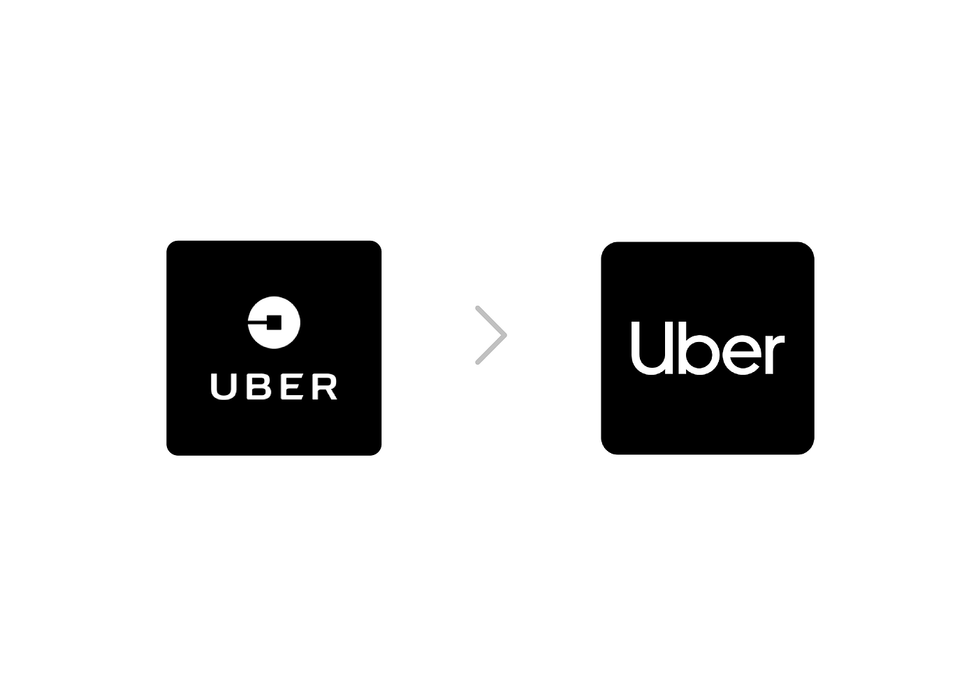
Beautiful. Isn’t it? Which is why I had the 🤔 look when I saw the stripped-down identity that is simply “Uber”. Of course, text-based logos do a great job but I wondered where the amazing idea had gone to in just a little over 2 years. The CEO, Dara Khosrowshahi explained that Uber was becoming a global company and that is about mobility, and beyond car ride-sharing. Now, this was further confusing for me. I felt that, if you asked me, the former logo, with its great story, was big enough in scope to cover whatever it was that Uber was looking to become. How far can it get that it wouldn’t fit into bringing people to the things that matter to them?
But then all I needed to read was their case study on the project.

According to Uber, they spent over 1000 hours listening to partners, drivers and riders from across the world — I hope they at least phoned Lagos. Their findings brought a necessary reality check to what they had crafted as a wonderful identity. The 2016 a&b (atoms and bits 🙄) logo had not connected with people as much they would have assumed. People wanted the letter U back (which the Uber logo v.1 was based on) and “Uber” was already such a generic name that the 4-letter word was the ‘symbol’ people wanted to see. It’s like how we ask for ‘Indomie’ when we need to get noodles. They decided aborting the mission to invest more in the a&b story was the right to do, while they fully claimed and maximized the uber word that was fast becoming the in-term (read “in-thing”).
“In God we trust, all others must bring data”
— W. Edwards Deming

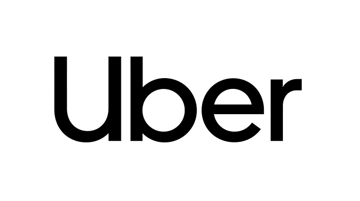
Above all, the Uber rebrand underscores the importance of research and the difference between design and art. Design must strive to be free of bias, as impossible as that is. It is impossible to be completely free of the bias of the designer(s), who may also regard himself/herself as an artist, same as the preferences of the decision makers. However, data from research must lead, if design must achieve its purpose. And who says you can’t have both? Uber’s new type, Uber Move was brilliantly created such that the letters U and b converge in an interesting subtle illustration of a road network. So, brilliant artistic work that agrees with the facts. “Sweet Logos Association” if you ask me.
If I was Uber’s CDO or FourthCanvas was the design agency engaged and I directly managed Uber as a client, it would have been hard for me to let go of the “atoms and bits” identity. It was the ideal brand story teller’s dream and sounded just perfect, just that most drivers and riders never got it! My partner, Bolaji Fawole argues that they could have marketed it better and I agree, but at the end, Uber has made a decision that makes it all easier, by listening to what their people think, and there is no faulting that.
The most exciting part for me is imagining the flexibility that must exist in such an organization as Uber. If they could change logos this often, I wonder how often they would redraw action plans, and that’s great. It’s the kind of organization I lead. On a lighter note, it makes so much business sense for us to see more of such flexible organizations over here. But seriously, organizations must be willing to let go of the past and present, once the facts pull in a new direction. Design as a process must seek to be more deliberate than beautiful a narrative.
(And… this comes timely at a time Uber needed a rebrand, as it recovers from the scandals it has found itself in, in recent times).
This story is published in Noteworthy, where 10,000+ readers come every day to learn about the people & ideas shaping the products we love.
Follow our publication to see more product & design stories featured by the Journal team.
