The near-future of the 9Mobile logo
Everyone seems to have moved on with the new 9Mobile brand identity, with a general consensus that the logo works, especially as they had a short time to perfect it and more importantly as the adverts and posters have come out excellently to make up. The way I see it, the identity works (like it’s fair) in the meantime, but a near-future refresh looks like something they should have on their Trello.
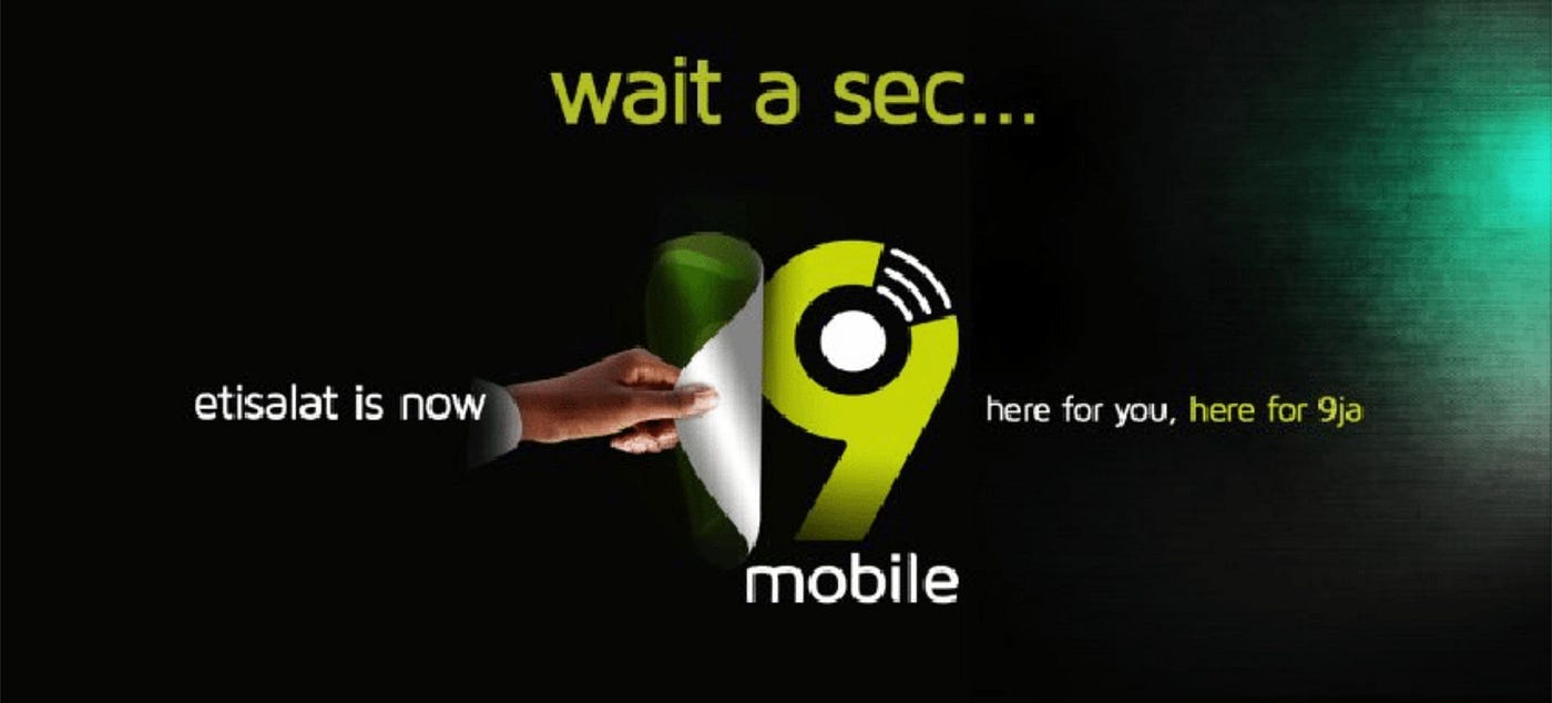
The announcement of what became of the old 0809ja brand, Etisalat Communications was met with a lot of anxiety and expectations. One of the major questions was what the logo would look like. And the ads…? How far or close would it be to the awesome brand identity of its precedent? Would it meet up with the ‘etisalat-level’, take it further or “fall our hand”?
In what was a really commendable response time, the jingles, TV ads, banners, digital ads were everywhere before agencies could put proposals forward. However, what got creatives, brand enthusiasts and a lot of other people talking was the logo. The overall reception was neither on the wow side nor the ‘wtf’ end of life. The design seemed to play as safe as safe could be. Everyone ‘sort of’ agreed that the design was not bad but at the same time could have been better.
Moving a step further from the 3-star ratings, I think (beyond all sentiment and bias of running an agency that would have done a better job with the logo) what stands between the 9Mobile logo and its excellence is one certain big issue, and another one arguable.
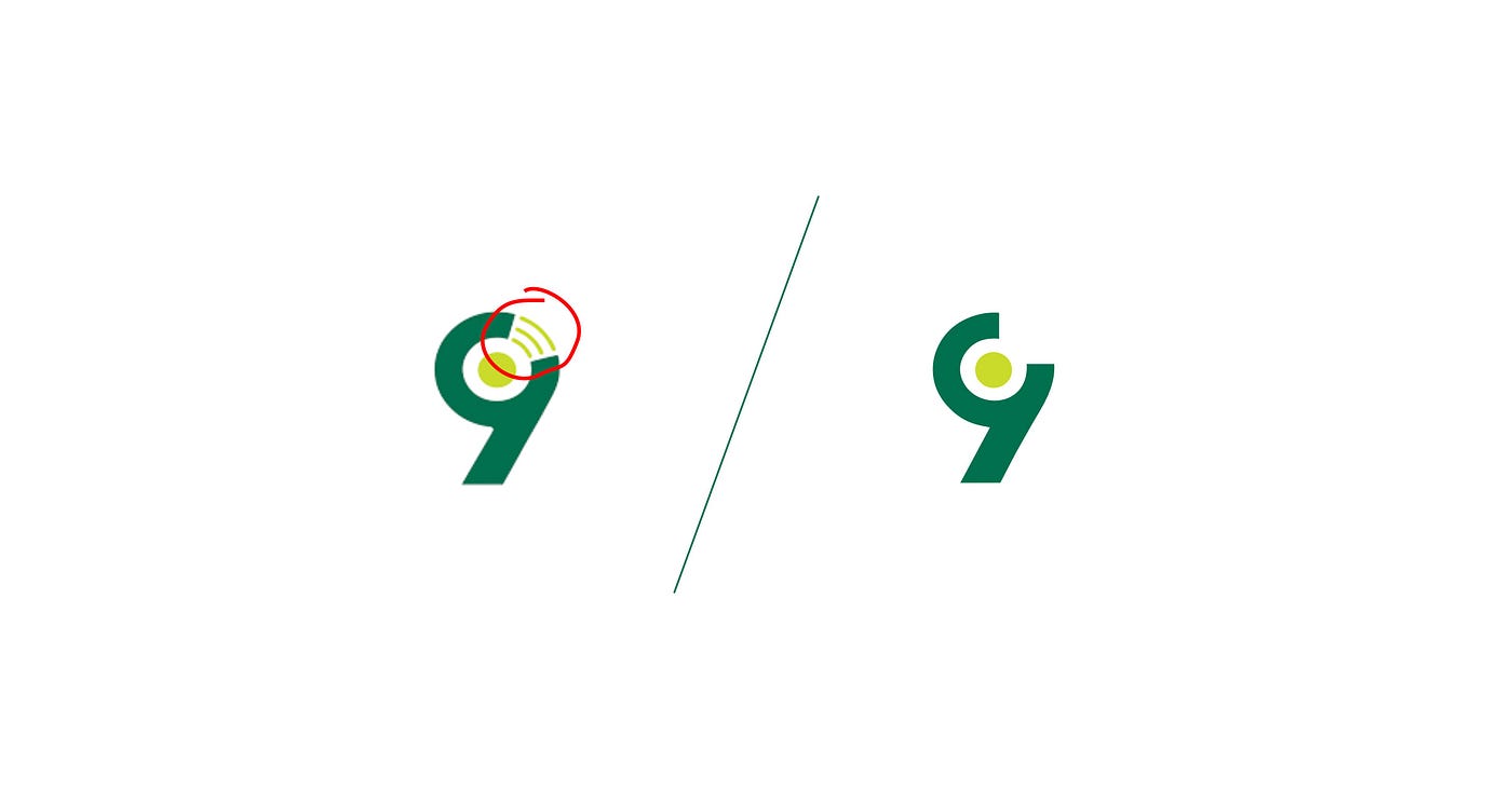
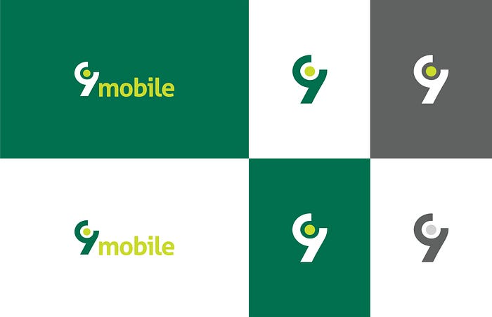
- The Wifi Symbol, really?
One strength of great and timeless logos of international brands like Nike, Fedex, Google and co is how they avoid latching onto obvious and direct elements of their services or products. Back home we also have easy references like GTBank and ARM Pensions. Abstract, memorable and timeless. The Wifi symbol is way too limiting and ‘not timeless’ for a brand that should be left as broad, elitist in perception and different as Etisalat was. One justification I assumed for the current logo and its directness was dismissed when I found out the internet data plans or call tariffs didn’t get any cheaper. So, you have the same target audience as always but then a direct wiFi-symbol-bearing logo you would have expected from maybe Glo. And even Glo did not go that way.
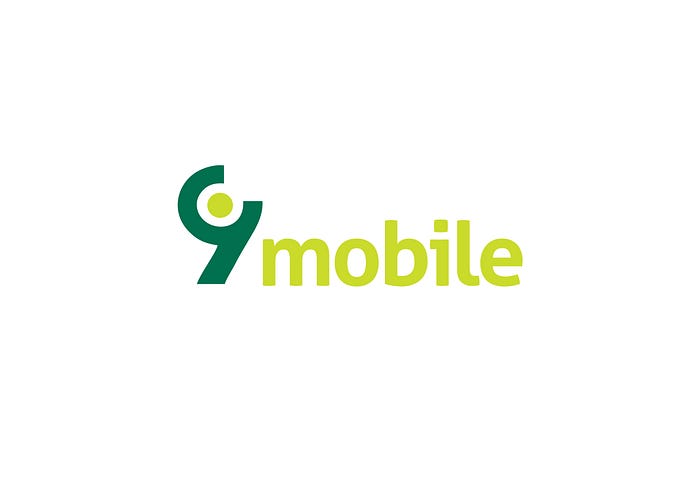
2. Typography
The 9 — bold, geometrical and all would have done better with a similar typeface for the ‘mobile’. The current logo looks too much like a forced marriage of characters. The letter ‘m’ highlights the construction imperfection of the typeface, which does not make it a bad font, but the wrong one to complement the highlighted big 9 (so big when you look at the most popular version of the logo).
Truth be told, the ads have been awesome, thanks to X3M Ideas. Beyond the wonderful infusion of imagery into the 9, what really kills it (for good) is what seems to be an answer to the number problem highlighted above: KINDLY DO AWAY WITH (OR AT LEAST ‘RELEGATE’) THE WIFI, and give us some ‘etisalat-abstractness’.

Our team at FourthCanvas put some design-action to this theory by exploring (with some free time over the weekend) a 9Mobile logo that moves further abstract and timeless, is freshened up in construction and bears a complementary typeface the big brother 9 always needed.
This could be an identity upgrade (or say brand identity refresh) for 2018 January, the first new year of the brand as 9Mobile which could work as its flag-off as a fully ready-for-the-future brand after all the turmoil, but this may be rightly considered way too expensive in terms of the investment already made implementing the existing. So 2023 maybe.
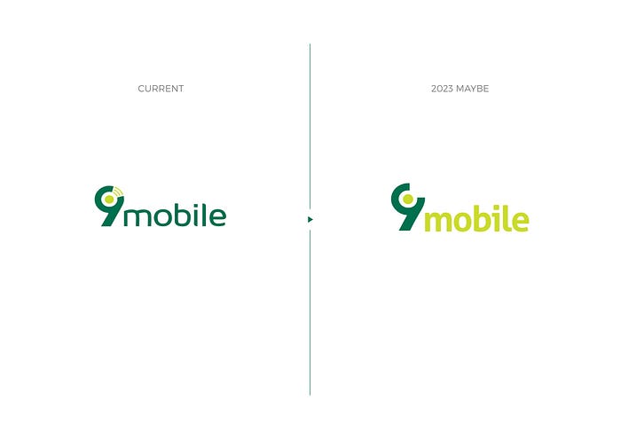
Whether as a New Year launch for 2018 or a relaunch for July 2023, at 5 years, this is what the near-future of the 9Mobile logo looks like or we can continue to manage the current identity, because well, “it is not that bad” and the WiFi, and its symbol may never ever get obsolete (a joke, obviously).

(Victor Fatanmi is the Art Director at FourthCanvas — Nigerian brand identity design agency)
